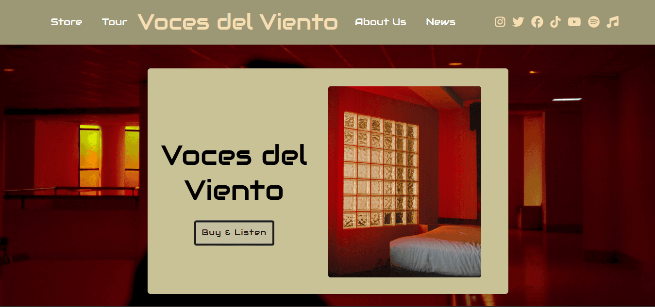
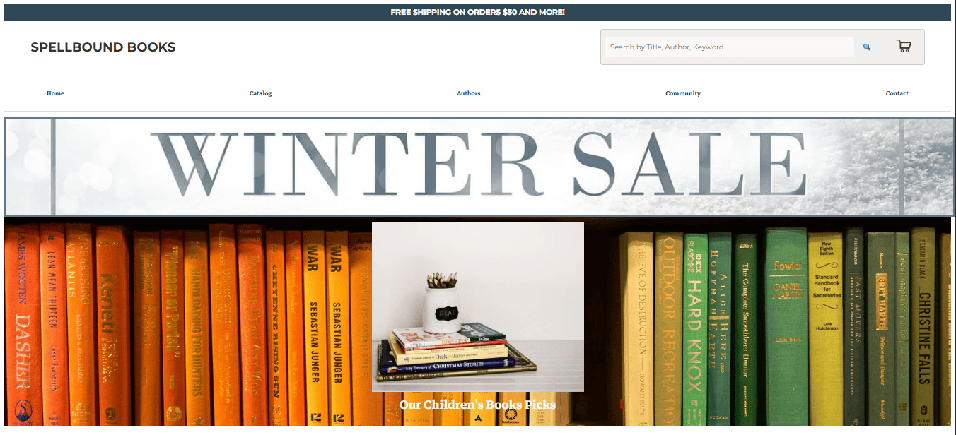
IT251 project: a responsive, multi-page website exploring the evolution of horror cinema, with sections highlighting historical eras, curated visuals, and accessible storytelling through design.
Project Overview & Goals
The goal was to design a responsive, content-rich site focused on the evolution of horror film. It needed to balance historical accuracy, strong visual hierarchy, and user-friendly navigation while demonstrating mastery of semantic HTML and CSS layout systems.
Features & Structure
- Sections for the Golden Age (1928–1946) and Slasher Era (1970s–1980s) with curated film lists and poster galleries.
- Responsive grid layout using Flexbox and CSS Grid with anchored navigation and image collections.
- Clean, organized file structure separating
css/,images/, and optionaljs/directories.
UX, Accessibility & Design
The site uses descriptive alt text, semantic heading levels, and keyboard-accessible navigation. Font choices and color palette were chosen for high contrast and legibility. The design adapts smoothly across screen sizes using flexible grids and media queries.
Sample Code (Responsive Poster Grid)
/* style.css (excerpt) */
.poster-grid {
  display: grid;
  grid-template-columns: repeat(auto-fit, minmax(200px, 1fr));
  gap: 1rem;
  margin: 2rem 0;
}

.poster-grid img {
  width: 100%;
  border-radius: 8px;
  box-shadow: 0 4px 12px rgba(0,0,0,0.2);
}
Lessons Learned & Next Steps
I strengthened my ability to build content-rich responsive layouts and integrate design storytelling with accessibility. Future improvements include adding JavaScript filtering for film eras, expanding the archive with new decades, and experimenting with animation effects.
View Live Demo


